When you click on Reports the first tab you will see is for Company Dashboards: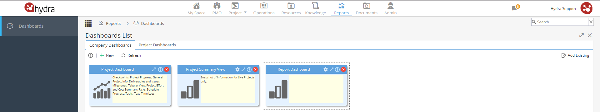
Using Dashboards:
-
A Dashboard is a collection of Widgets.
Simply double click on a Dashboard to see the widgets.
Widgets are small sections which provide users with summarised information: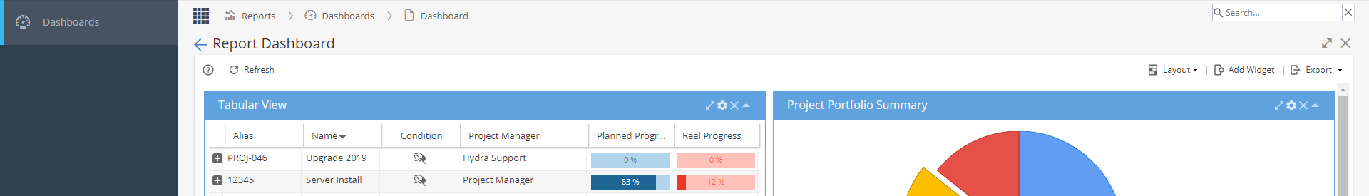
-
At the top left of the Company Dashboard tab, click + New
You will see the Create Dashboard screen: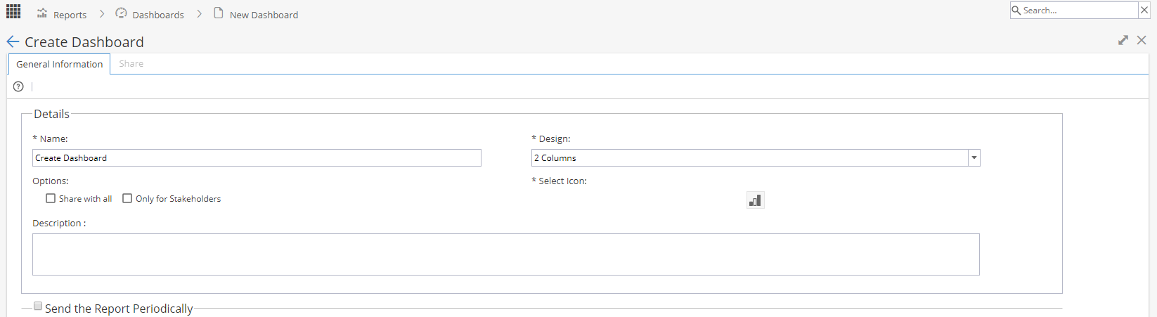
Name - Shows in the blue header bar of the Dashboard
Design - Layout Options
Share with all - Give access for anyone with the Reports menu to view this Dashboard, if you want to share the Dashboard with selected Profiles or specific Users.
You will be able to do this once your Dashboard is created and the share tab becomes available.
Only for stakeholders - Select this option if you are intending to share the dashboard with external users / customers so they can not see report information which are not intended to be shared (e.g risks and issues)
Example of Dashboard with stakeholder option ticked:
Header bar is yellow and restricted items are not included in the view.
Example of Dashboard with stakeholder option not ticked:
Header bar is blue and all items are shown.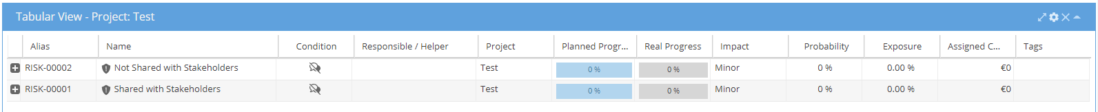
Note: This view applies to anyone the Dashboard is shared with, if you wanted internal users to see all information and external users to only see the restricted information you would need to create two versions of the Dashboard with the stakeholders option ticked for the customer version.
Select icon - Choose from list a picture to display on the left hand side of your Dashboard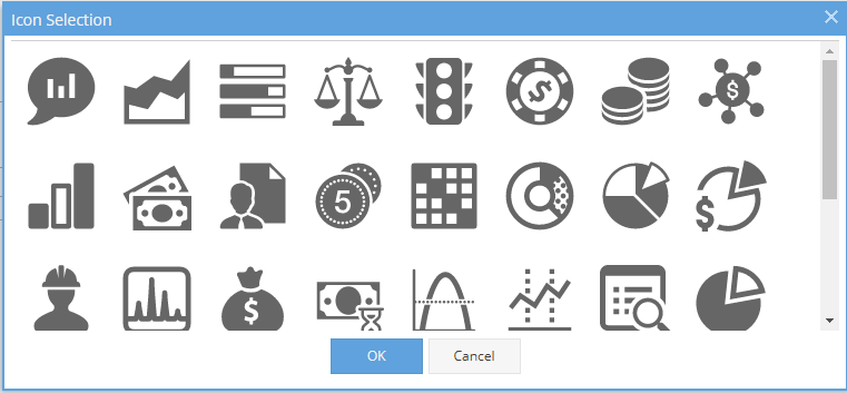
Description - Additional Information shown in the yellow box from your Dashboard List screen
Send the report periodically - Once your widgets are configured you can check the box to send your report out on a regular basis. -
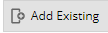
Click Add Existing from the top right
The screen will show any existing Dashboards available but not currently included in your view, if you have a lot of Dashboards showing you can search by name: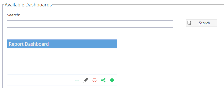
On the bottom right of each Dashboard there are some options: Add - To include the Dashboard back in your view
 Edit - Takes you to the General Information tab to update Name, Layout, Icon, Description and Sending Report
 Delete - Remove the Dashboard completely, this will no longer be accessible.
 Share - Takes you to the Share tab
 Info - This gives the same pop up as the ? icon on the Dashboards, confirming the owner and creation date
 -
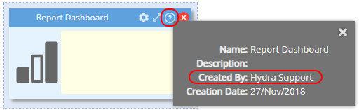
Click on the ? icon on the Dashboard header and look for the name next to created by:
-
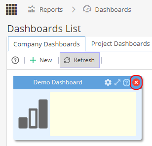
From the Dashboards List screen, click on the red x for the Dashboard you want to remove
You will be asked to Confirm: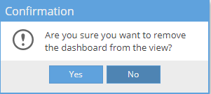
At this point, the Dashboard is removed from your view, anyone who has access to the dashboard through sharing can still see it but the Dashboard can be added back to your view using the "Add Existing" option on the top right.
If you want to delete the Dashboard for good, click the red icon: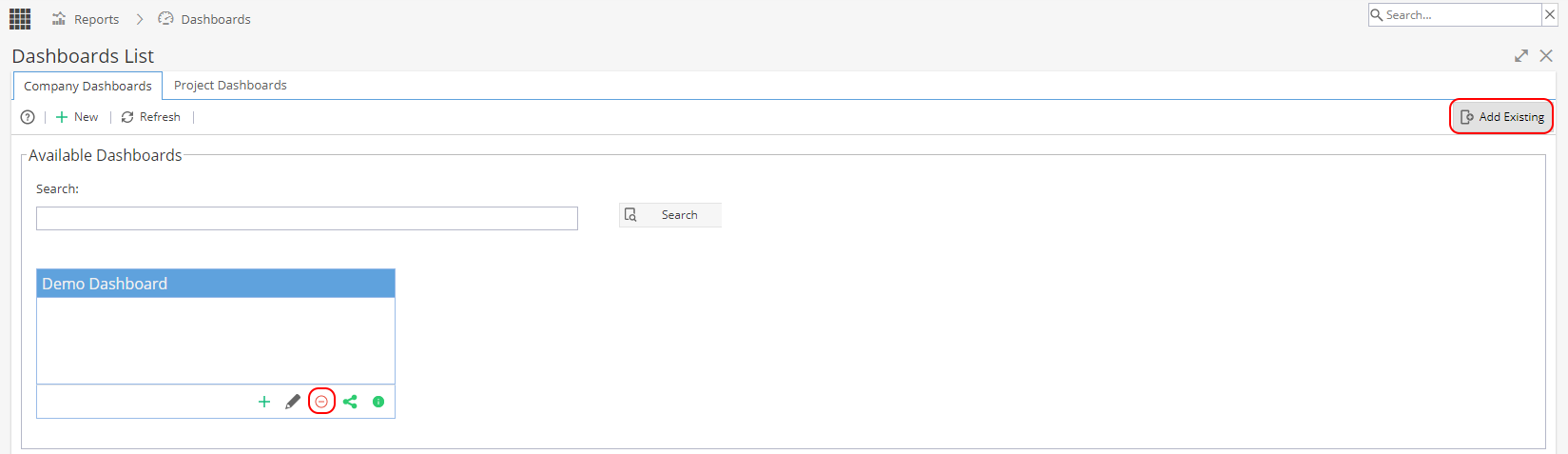
Remember when a Dashboard is deleted it can not be recovered so you will need to confirm you are sure you want to delete this: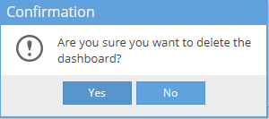
Now the Dashboard is removed from all views and can no longer be accessed by anyone.
If you need the data again, you will need to recreate the Dashboard.
Using Widgets:
-
On the top right of the screen you will have the Add Widget button.
This will display a list of any widgets which are available to add by clicking on the white arrow on the top right of the blue header bar.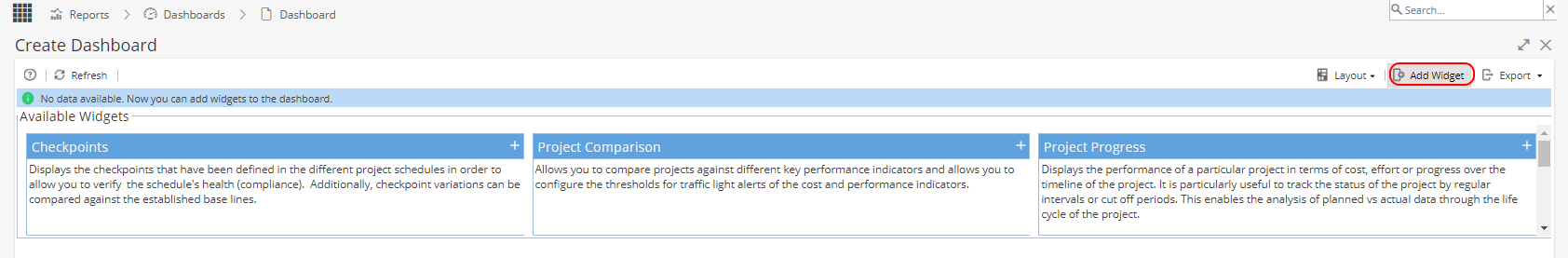
Note: You can add multiple widgets of the same type e.g if you want to compare more than one project.
-
To remove a widget click the X on the top right.
Any widgets which have been removed will always be available to add back in again.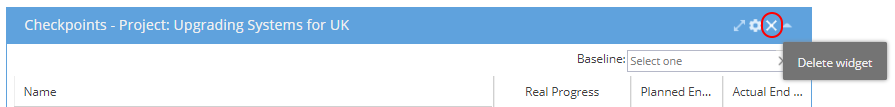
-
On the top right hand side you have an option to change the layout.
The most commonly used is 2 columns (split 50/50) but you can select whatever option you prefer.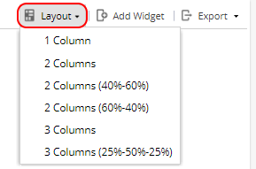
-
Click the title of a Widget and drag it to the desired position.
Move your most commonly used widgets to the top of the screen or whichever order you prefer. -
Using the single arrow on the top right of a Widget allows you to minimise the widget so only the blue header row is visible.

-
Clicking on the arrow in the middle will expand the widget to full screen.

Once expanded, the arrow icon will change to point inwards, this will set the widget back to normal size.
The expand arrow is also shown again at the top right of the screen, this will maximise your Overview screen by hiding the menu items on the left.
The X will close the screen until a new menu/screen is selected to be displayed.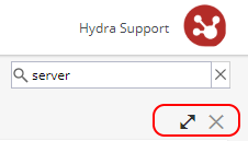
Sharing / Sending Dashboards:
-
If you are the owner (person who created the Dashboard) you will see a cog icon:
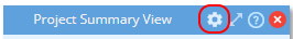
When you click on this you can go to the share tab: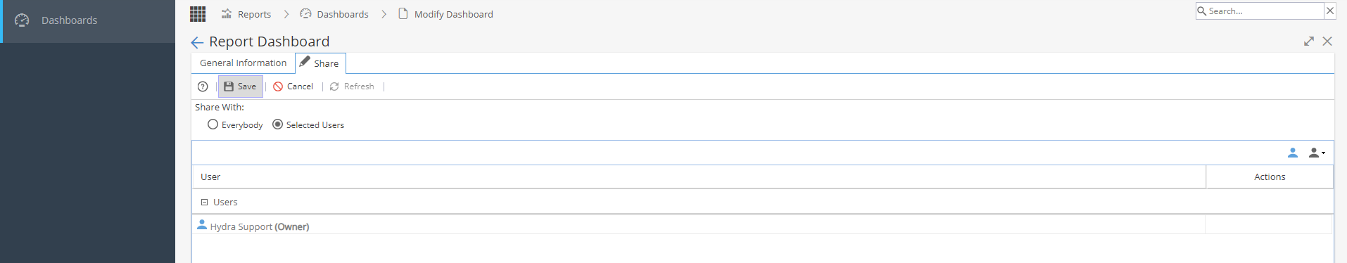
Double click in the screen to get to edit mode, where the pencil icon shows on the tab.
You will now have the option to:
Share with Everybody (*Any user with Access to the Reports menu)
Share with Selected Users, which gives you two actions:
- Clicking on the blue icon to search for and give access to specific users
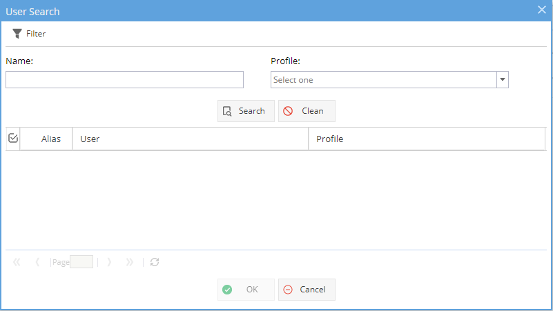
- Clicking on the grey icon to give access to users based on their profile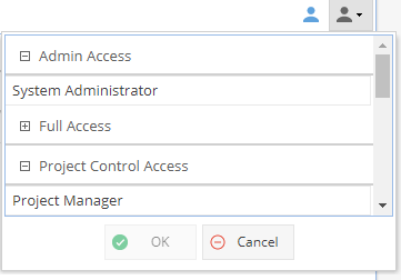
Users you have shared the Dashboard with will now have the option to view or export the Dashboard.
They can not make any changes to the Name, Description, Icon, Shared With or Send Periodically details. -
If a Customer / User gets this error when clicking on a shared dashboard:
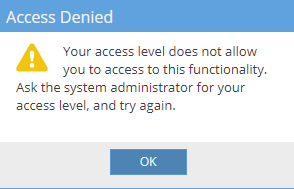
Look at Resources > Profiles > Profiles List and check the Access: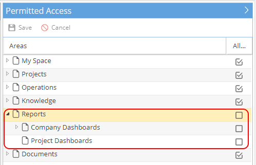
The Reports menu will need to be ticked for users to see the Dashboards shared with them. -
If you are the owner (person who created the Dashboard) you will see a cog icon:
This will take you a general information tab where you have a tick box to Send the Report Periodically to any users on the Share tab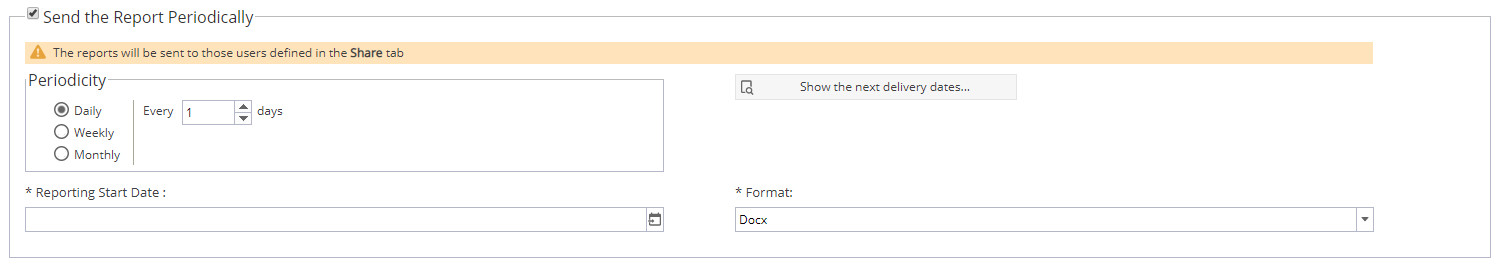
The report can be sent as an attachment or a link - This option is set at Company Level under Admin > Configuration > Company Preferences > Scheduling Report Delivery The Send Report Periodically option is best suited to data tables, some of the graph views can not be included. If you need the graphs we would recommend using the export option instead.
If you do not have the cog icon you have 3 options:
- Ask the Dashboard owner to update the settings
-Export the Dashboard manually to send / share
- Recreate a copy of the Dashboard so you can send automatically -
When you double click into a Dashboard you can use the export button on the top right.
You have the options for Docx, PDF (Page Break or No Page Break) or Excel.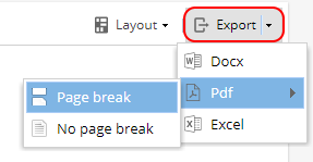
Widgets Available for Company Dashboard:
-
Widget:
Configure:
*Note: The Project drop down option will only appear when added to a Company Dashboard - only one Project can be selected.
To view multiple Projects you can go to PMO > Projects > Checkpoints OR create multiple versions of the checkpoints dashboard.
Available Fields:
Name
End Date (Planned End Date of Flagged Task in Schedule)
Real End Date (Actual End Date)
Real Progress (% Complete based on tasks prior to this checkpoint)
Example View: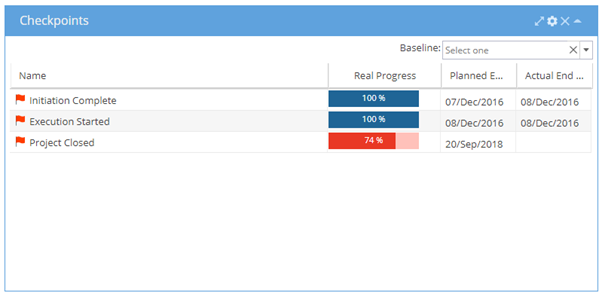
*Note: A Baseline can be selected from the drop down at the top right if required
Additional options can be reached from expanding the widget using the arrows on the top right
Export Options - Allows you to export the data table to CSV, Excel or PDF format: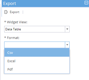
-
Widget:
Configure: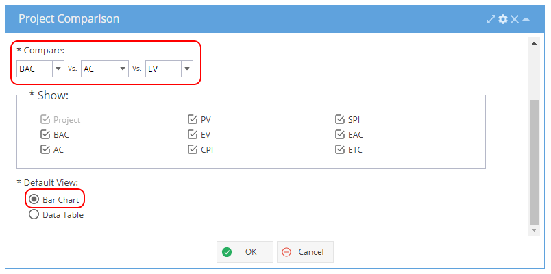
Note: Compare options can be a combination of 2 or 3 items using BAC, AC, PV, EV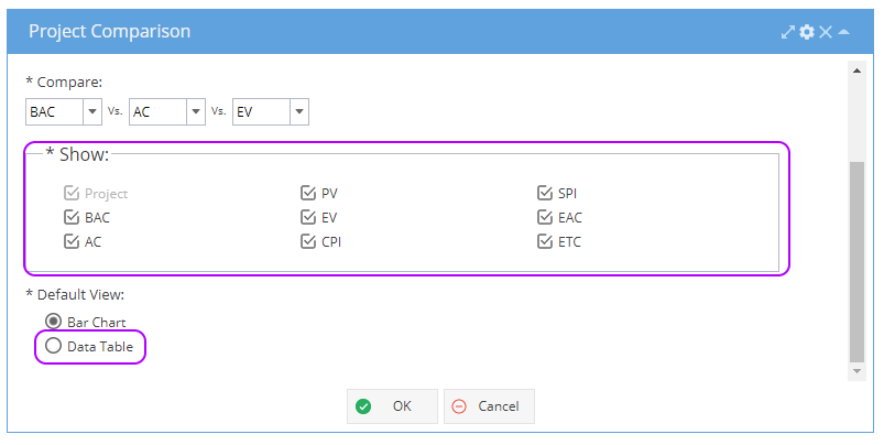
Available Fields for Data Table:
Project Name, BAC, AC, PV, EV, CPI, SPI, EAC, ETC
Example View (Bar Chart) with the Compare options: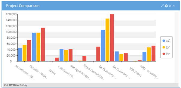
Example View (Data Table) with the Show options: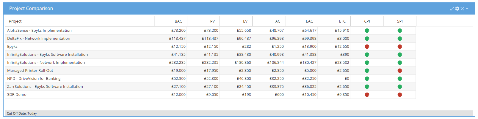
Additional options can be reached from expanding the widget using the arrows on the top right
Expanding the widget will include both the bar chart and data table views.
On the top right you will see a spanner icon for Metrics: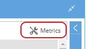
Metrics allows you to adjust the traffic light system for SPI / CPI: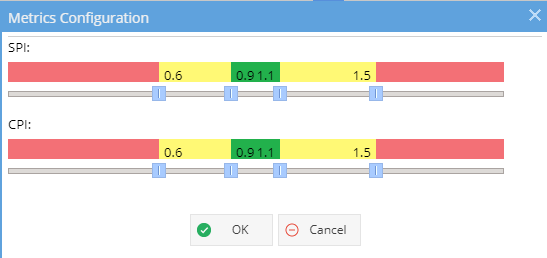
Options - Additional Filters, allows for cut off date to be specified: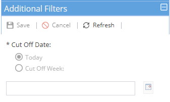
Export Options - Allows you to export the bar chart or data table as an PNG image: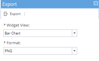
-
Widget:
Configure: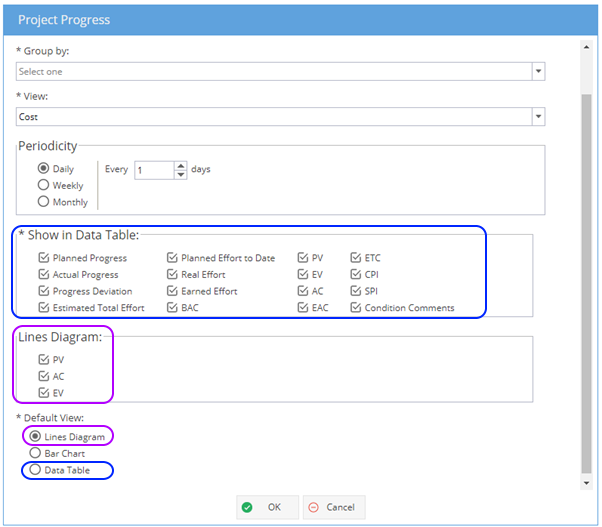
Note: The Group By drop down is only available for the Company Dashboard, the drop down gives the options to group by Organizational Unit, Project, Tag (Inclusive or Exclusive)
The Lines Diagram will display planned / actual / earned or ideal information for the view selected (Cost, Effort or Progress). For cost and progress you will have the option to select a Baseline on the top right.
The Bar Chart option will display planned / actual information for the View selected (Cost, Effort or Progress)
The Data Table will show the fields selected from the tick box options.
What is Ideal PV on the Lines Diagram option?
Ideal PV is a reflection of the current planned curve, shown as a red line reflecting what is in the plan right now.
The difference between the blue line (Planned Progress) and red line (Ideal PV) is a change in the scope of what was originally planned against current planned values.
Example View with effort: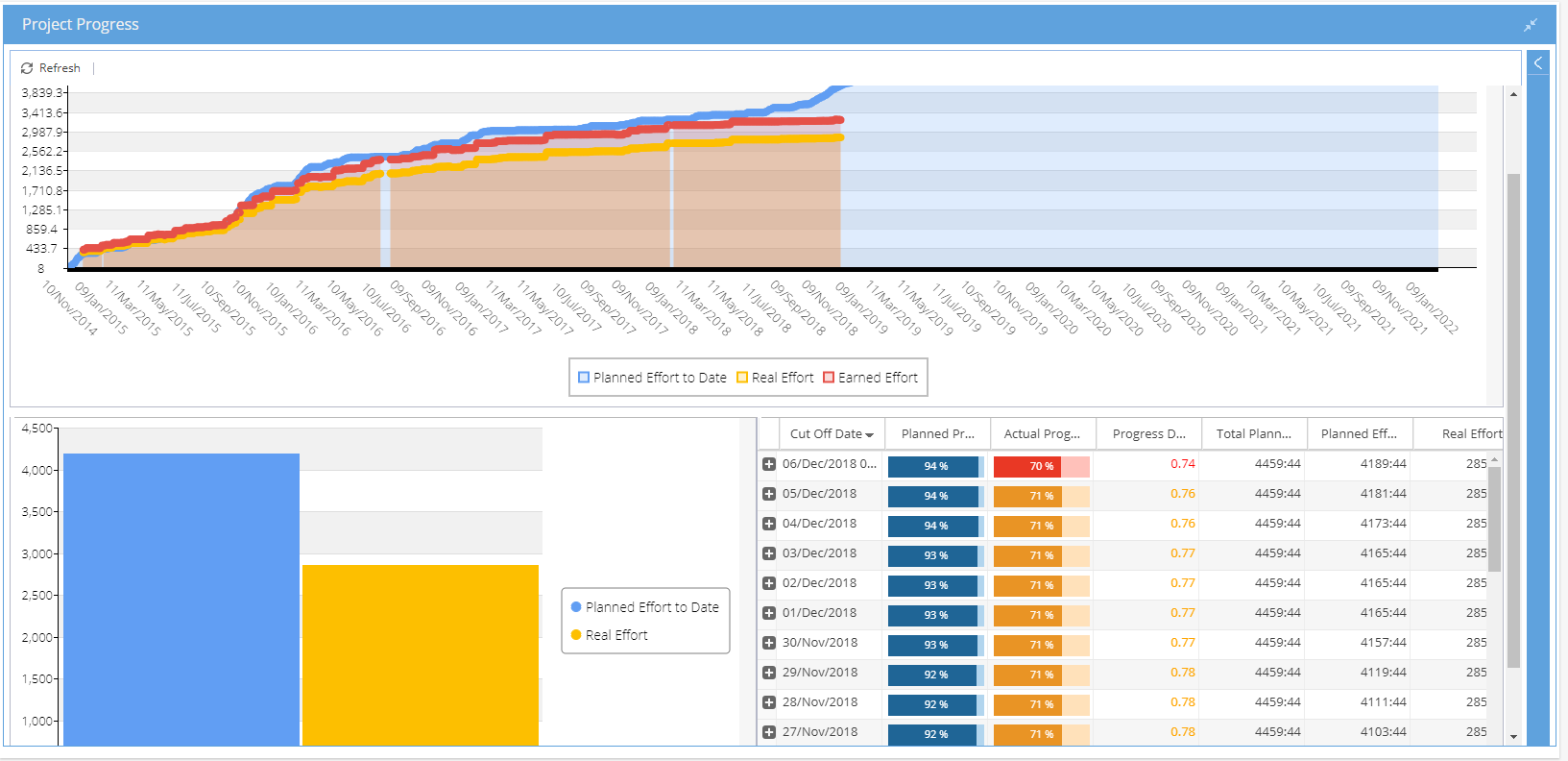
Additional options can be reached from expanding the widget using the arrows on the top right
Expanding the widget will include all views; line diagram, bar chart and data table
Within a Project Dashboard, you will be able to see / update the condition on the top right: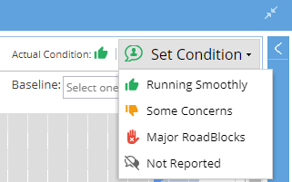
The details panel gives you the same options as the configure cog icon.
Export Options - Allows you to export the line diagram, bar chart or data table as an PNG image: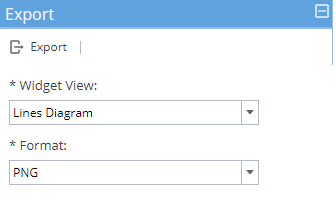
-
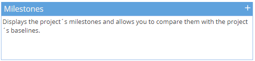
Widget:
Configure: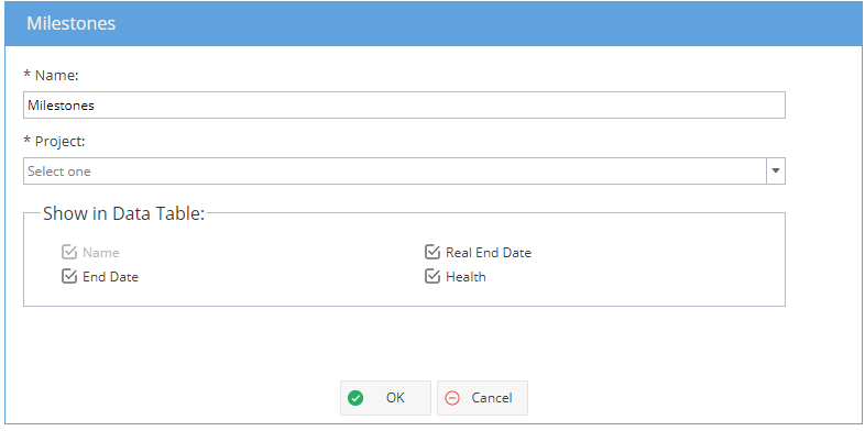 Note: The Project option will only appear for the Company Dashboard
Available options:
Milestone Name
End Date (Planned End Date from Schedule)
Real End Date (Actual End Date - When Milestone Task marked as Completed)
Health
Example View :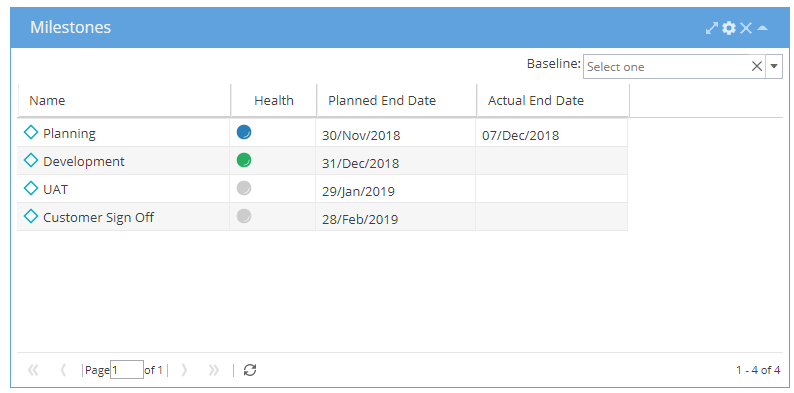
*Note: A Baseline can be selected from the drop down at the top right if required
Additional options can be reached from expanding the widget using the arrows on the top right:
The details panel gives you the same options as the configure cog icon.
Export Options - Allows you to export the data table as CSV, Excel or PDF format: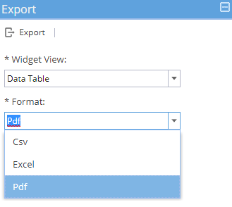
Note: Tasks listed with 0 hr effort can show with a green diamond icon on the Gantt chart but this report widget will only show actual milestones where you see the green diamond icon next to the Task Name on the schedule: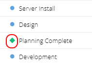
-
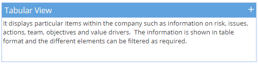
Widget:
Configure: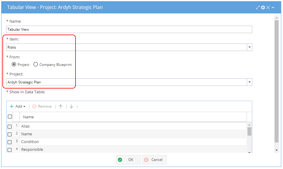
Note: The From / Project / Blueprint options and the Item "Projects" will only be available from the Company Dashboard
Available options to add to the Data Table will change depending on Item selected
Example View (Risks):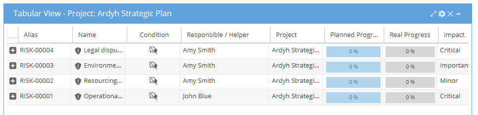
Additional options can be reached from expanding the widget using the arrows on the top right:
The details panel gives you the same options as the configure cog icon.
The Additional Filters gives 2 options:
Choice, where you can filter by Item e.g. Risks (all other options will show as greyed out)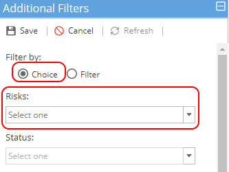
Filter, where you can filter on any other options (Risks will show as greyed out)
Status, Condition, Responsible, Impact, Probability, Tags, Schedules, Category, Risk Strategy, Source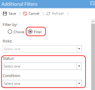
Export Options - Allows you to export the data table as CSV, Excel or PDF format: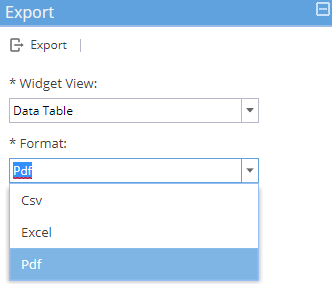
-
Widget:
Configure: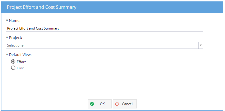
*Note: The Project drop down option will only appear when added to a Company Dashboard - only one Project can be selected.
For comparison of multiple Projects, you can create the dashboard multiple times or try using the PMO > Projects > Progress view for effort and the PMO > Projects > Costs view for costs.
Example View (expanded to show both effort and cost):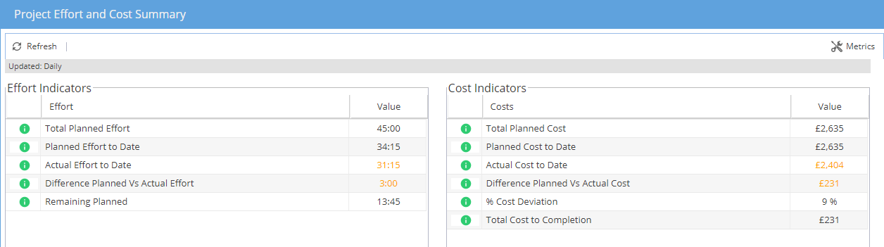
If you are not sure what the indicators are based on, hover your mouse over the green i on the left to get more information: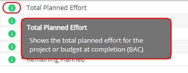
Additional options can be reached from expanding the widget using the arrows on the top right
Expanding the widget will include both the effort and cost views.
On the top right you will see a spanner icon for Metrics:
Metrics allows you to adjust the traffic light system for both Effort & Cost: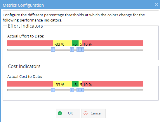
Options - Additional Filters, allows you to set how often the view is updated: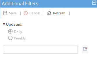
Export Options - Allows you to export the effort or cost view to CSV, Excel or PDF format: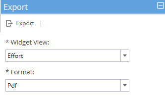
-
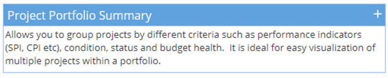
Widget:
Configure: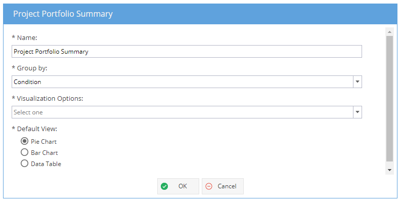
Group by: Budget Health (Over / Under Budget), CPI, CVI, Condition*, Organizational Unit, SPI, SVI, Status, Tag
*Condition will give you “Visualisation Options”: Estimated Cost, Estimated Revenue, Projects count, Real Cost, Real Revenue
Example View (Expanded to show all views grouped by SPI):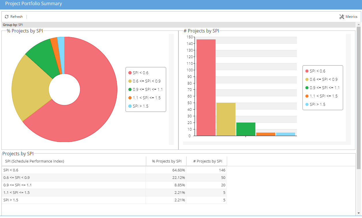
Additional options can be reached from expanding the widget using the arrows on the top right
Expanding the widget will always include all 3 views, the pie chart, the bar chart and the data table.
On the top right you will see a spanner icon for Metrics:
Metrics allows you to adjust the traffic light system for SPI, CPI, SVI and CVI: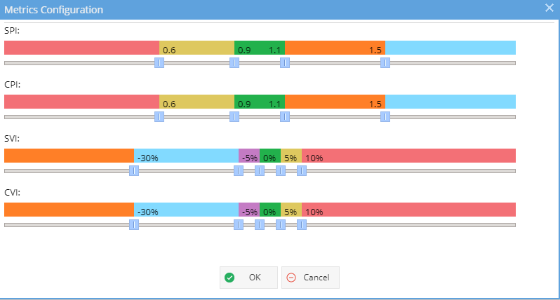
Options - Additional Filters, allows you to filter on Status, Condition or Tags (inclusive or exclusive)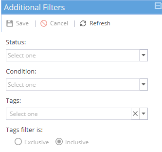
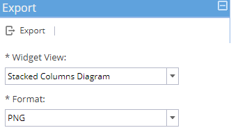
Export Options - Allows you to export the pie chart, bar chart or data table as a PNG image: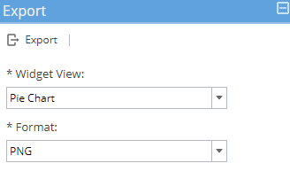
-
Widget:
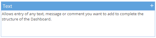
The text widget gives you greater flexibility for the information displayed as part of your report dashboards but it must be updated manually by the report owner.
Configure: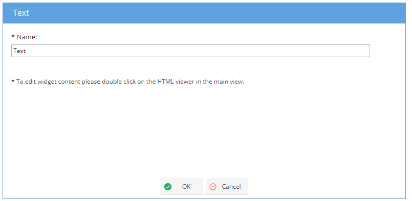
Note: The only part of this widget to configure is the Name.
When the widget is first added, you will only be able to see white space.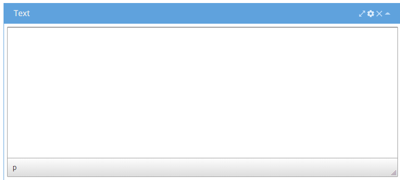
Double click into the widget to get the text editor.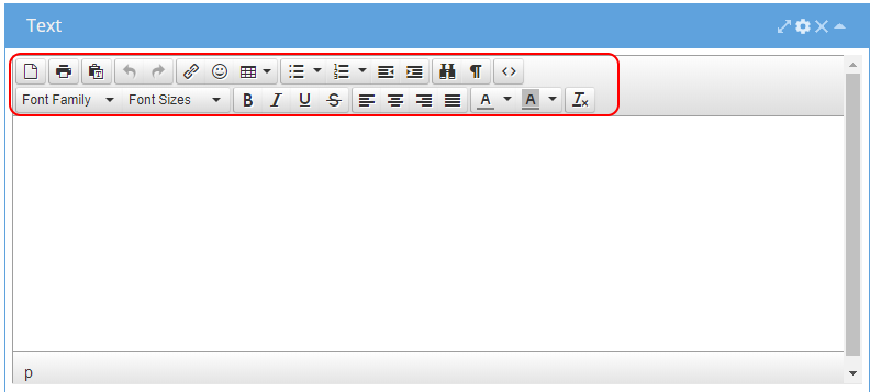
 New - Deletes all existing information and starts with a blank sheet.
Print - Print the text widget view
Paste (Plain Text)
Undo / Redo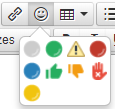
Insert / edit a link
Add Icons
Insert Table Bullet Points
Numbered List
Decrease Indent
Increase Indent
Find and Replace
Show blocks
Source Code (HTML)
Font
Font Size
Bold, Italic, Underline, Strikethrough
Align Left, Centre, Right or Justify
Text Colour, Background Colour
Clear Formatting
Example View: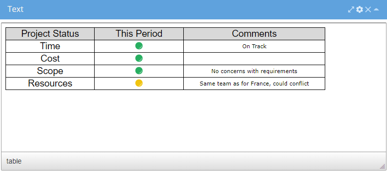
Additional options can be reached from expanding the widget using the arrows on the top right
Expanding the widget will give you a wider view of the data table
The details panel gives you the same option as configure which only allows you to update the widget name
Export Options - Allows you to export the table as a PNG image. -
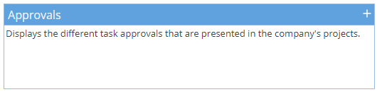
Widget:
Configure: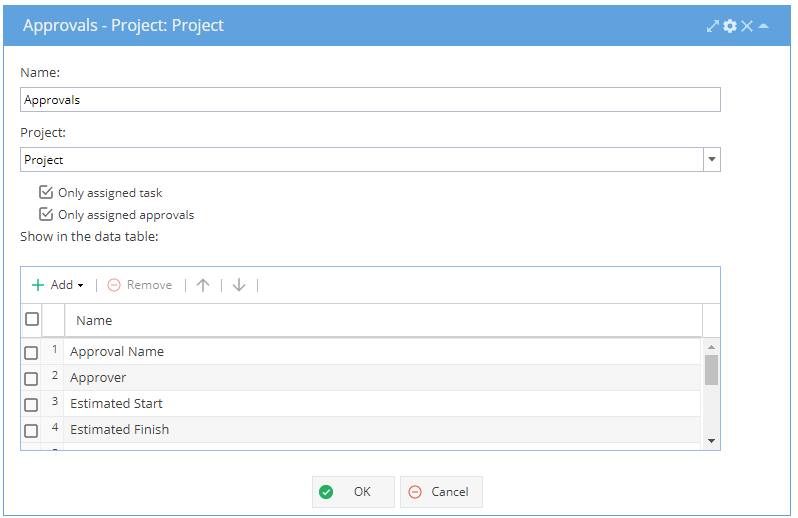
Example View (Data Table):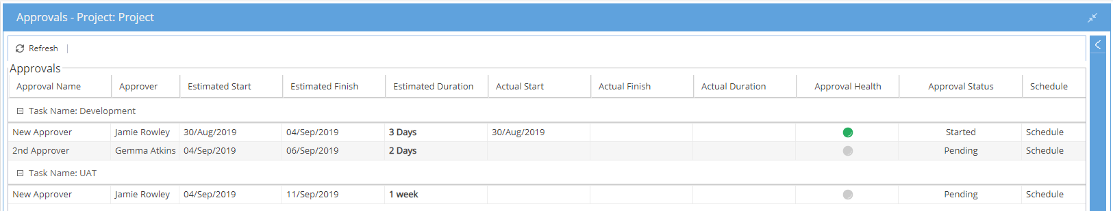
Additional options can be reached from expanding the widget using the arrows on the top right
Options - Additional Filters:
Choice - Filter by Tasks
Filter - Filter by Approval Health, Approval Status or Schedule.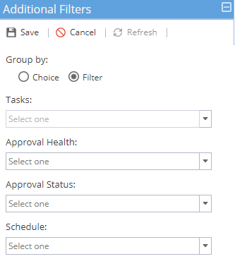
Export Options - Allows you to export the data table as CSV, PDF or Excel: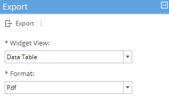
-
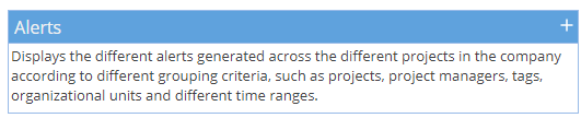
Widget:
Configure: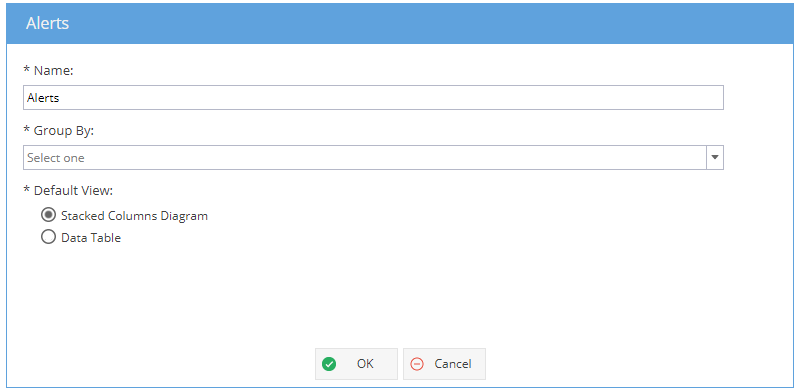
Example View (Data Table):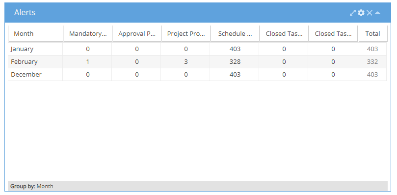
Example View (Stacked Columns / Bar Chart):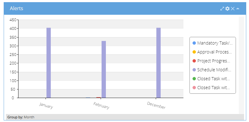
Additional options can be reached from expanding the widget using the arrows on the top right
Expanding the widget will include both the bar chart and data table views.
Options - Additional Filters, allows for filtering of Alert Type, Projects, Organizational Units, Tags, Project Managers, State and Importance: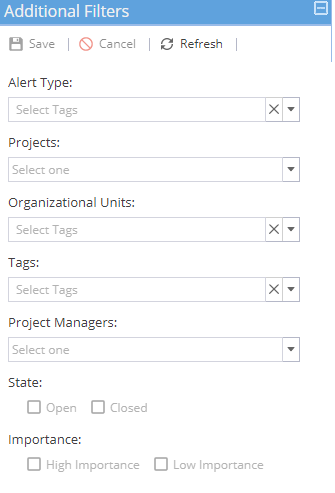
Export Options - Allows you to export the bar chart or table data as an PNG image: